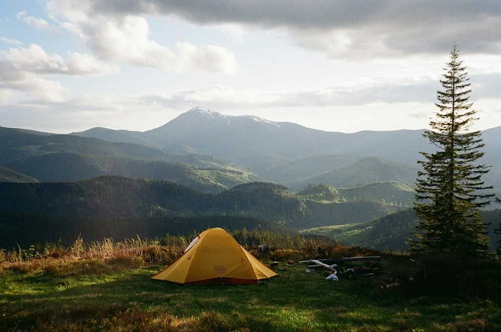
READY TO START your
Journey to an epic brand?
Together we’ll design a brand identity and website you love.
Let’s go!
Dot & Peg is your pocket-sized creative design partner.
As versatile and dependable as a penknife, I’m here to supply the complete tools and skills to bring your brand to life.


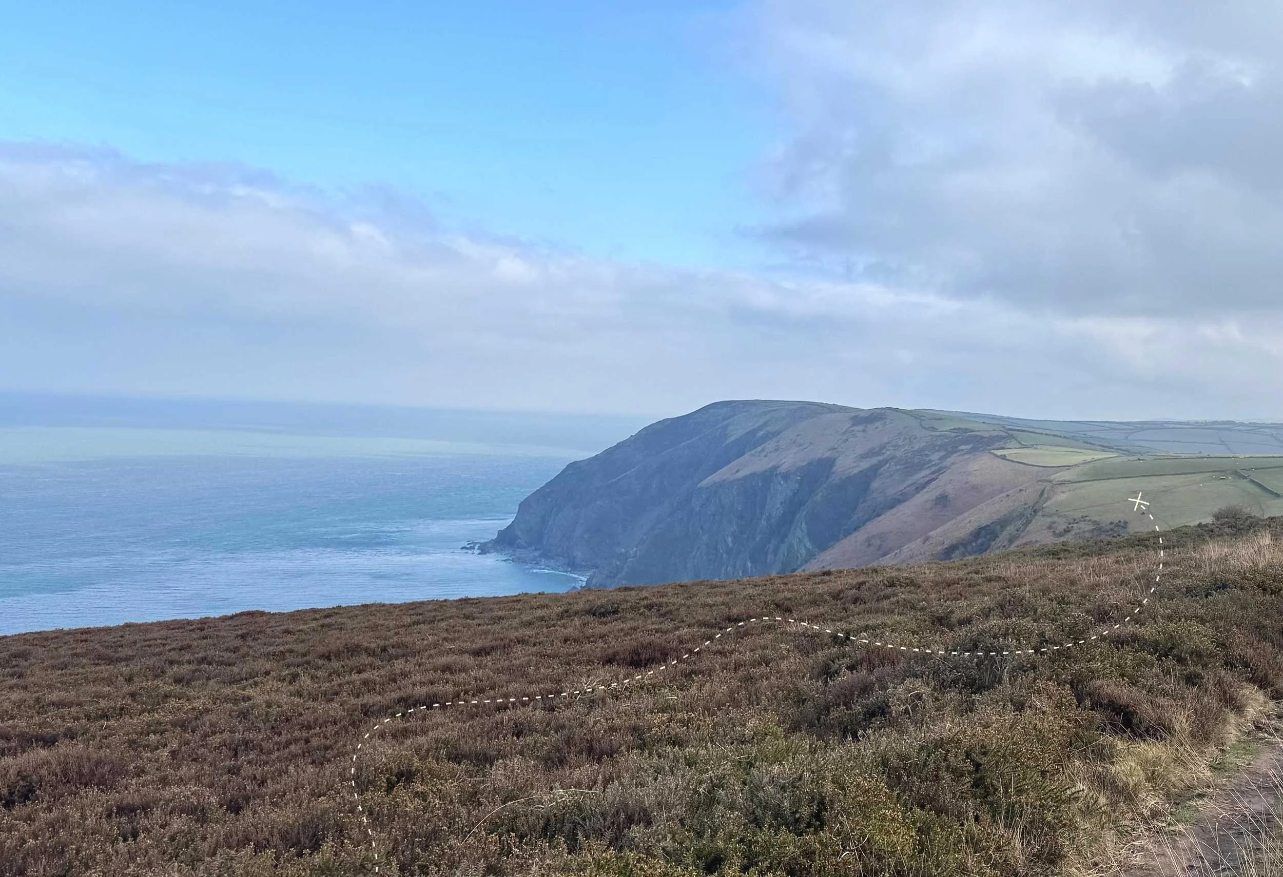
If you’re new to the territory of branding and design, it’s easy to feel lost.
Dot & Peg helps startup and small business brands figure out where they need to go. Together we’ll blaze a trail and discover a visual identity that’s perfect for you.

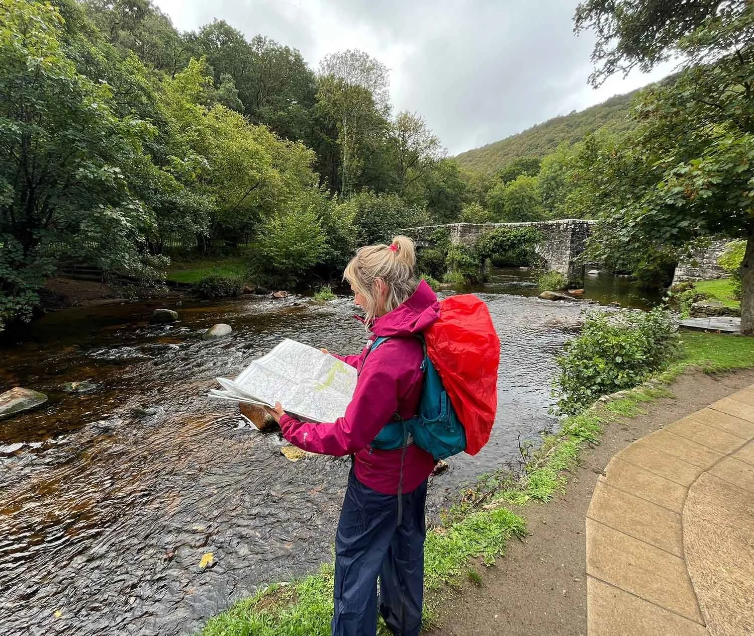
Welcome! I’m Laura and I’ll be your guide.
As an adventure-loving branding and web designer, my mission is to be your own personal design compass, helping you navigate your way to a brand identity and website you love.

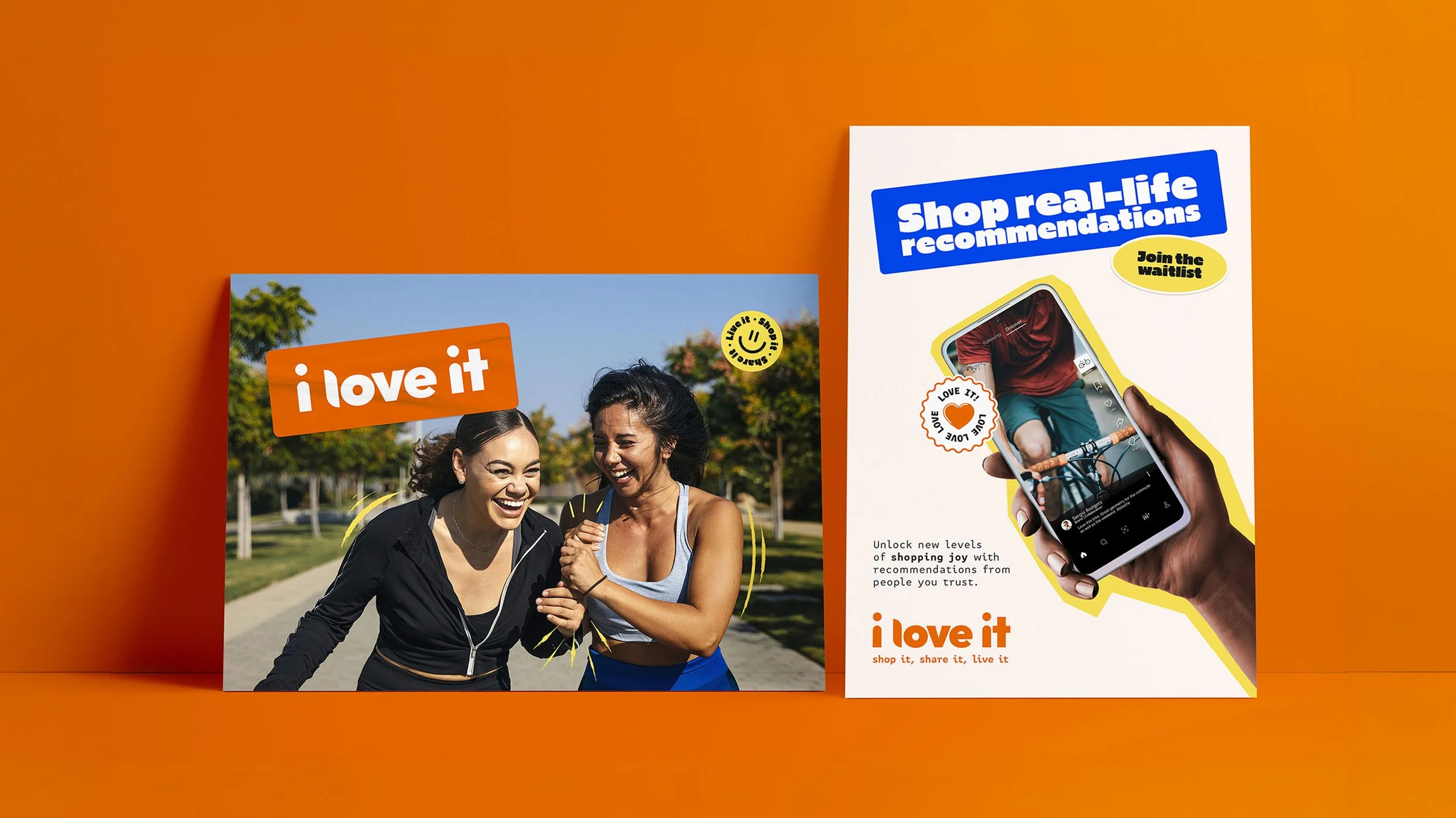
Brand Identity & Squarespace Website
A bold brand identity visually expresses what your business is all about.
We’ll work together to explore your unique brand attributes and then showcase them to your customers with immediacy and warmth. A bespoke website then translates your branding to the digital space, allowing people to find and interact with you so your business can grow.
Got a different adventure In mind?
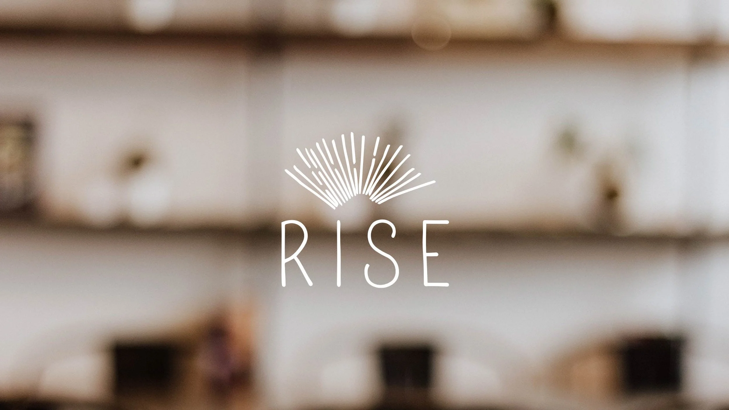
BRAND IDENTITY
Mighty businesses are built from strong foundations. We’ll start by mapping your vision. From here, let’s create a stand-out brand identity rooted in clarity and personality that attracts your target customers and makes you proud.
BASECAMP
Squarespace Website
Perfect for small businesses that want a simple way to make a strong, stylish digital statement. With a branded website designed and built by Dot & Peg, you get a functional and flexible online presence that you can easily maintain and update yourself.

SUMMIT
Bespoke Design Days
Does your branding need a tune-up or need some templates? Book a day of design and I’ll adjust, tighten and refresh your assets. These quick but effective fixes will create a consistent brand presence across every touchpoint to send your brand onwards and upwards.

DESIGN HUT

SQUARESPACE WEBSITE
↟↟
BRAND IDENTITY
↟↟
DESIGN DAYS
↟↟
SQUARESPACE WEBSITE ↟↟ BRAND IDENTITY ↟↟ DESIGN DAYS ↟↟


Ready? Get your adventure underway!


From a standing start, she instinctively understood what we wanted our business to represent. Laura listened intently, asked thoughtful questions, and helped us articulate a vision we hadn’t quite found the words for ourselves.
The brand strategy she developed was authentic, purposeful, and completely aligned with who we are. We will feel forever grateful for her work and the impact she’s had on shaping the foundation of our business.
— Joe Laffar, Operations Director, Engage Scaffold Design and Engineering